Pearch
Podcast platform with a AI powered search engine

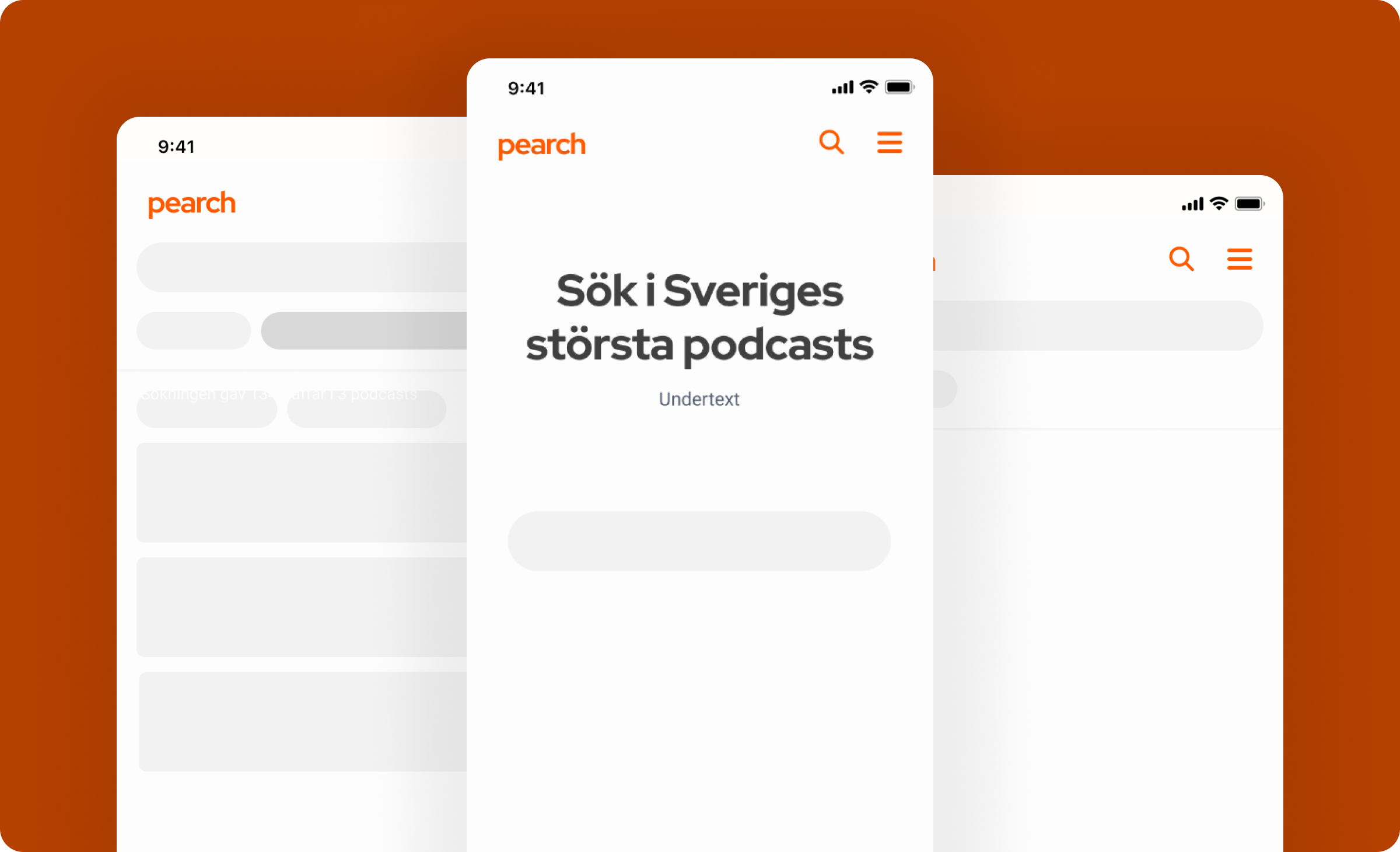
Pearch was a startup on a mission to transform how people discover and interact with podcasts. Their vision was clear: empower users to search for specific topics or references across all podcast episodes—something that traditional platforms often struggle with.
Imagine trying to remember which episode of your favorite show mentioned that remote island south of Peru—or diving into a new hobby and wanting to hear conversations about it. Pearch makes that possible.
As the UX designer on this project, I helped bring this vision to life by designing intuitive search experiences powered by AI. The goal was to make content more accessible, searchable, and meaningful, no matter how niche the topic. My role focused on aligning user needs with technical capabilities to create a seamless, engaging interface that invites exploration and discovery.
EMPLOYER
Pearch
ROLE
Lead UX/UI Designer
LOCATION
Stockholm
ASSIGNMENT
Create the UX/UI for web and a brand identity
Challenge
One of the biggest challenges in this project was that Pearch needed more than just a functional interface—they needed a brand. While the core concept was strong, there was no visual language in place to clearly communicate their mission to users.
As the UX designer, I worked closely with the team to define a cohesive identity that would not only support the product’s functionality but also express its unique value. This meant exploring everything from typography and color schemes to tone of voice and brand personality, ensuring the platform felt both innovative and approachable.

Approach
To align the team around a shared vision, I developed a set of low-fidelity wireframes that established the core structure and content hierarchy of the platform. These early sketches helped us quickly iterate, gather feedback, and ensure we were all on the same page before moving into more detailed design work.

Design decisions
To bring clarity and consistency to the product, I developed a graphic profile centered around a light, clean aesthetic. The palette featured primarily white and soft blue-gray tones, chosen to complement Pearch’s vibrant orange brand color and create a modern, approachable feel.
These visual elements were then formalized into a design system, establishing clear guidelines for typography, color usage, and component styling. This system ensured consistency across the platform and provided a solid foundation for future design and development work.

Results
The final result was a highly satisfied client with a product that clearly communicated their unique value to the world. Core features—such as advanced podcast search, result filtering, and seamless episode playback—were thoughtfully integrated into a clean, intuitive interface that prioritized usability without compromising on functionality.
Following the launch, Pearch successfully secured funding and began expanding its user base. With a strong visual identity and user-centered design foundation in place, they’ve continued to grow and evolve their platform.


